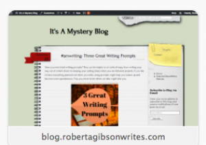
Today I decided my blog looked too messy and decided to change the theme. I thought the notebook look was fun at first, but got tired of it.

I think the new header image is more “mysterious.” Does the accent color of the text in the sidebar match the header in your browser?
So, what do you think?


I think the color is slightly darker in the side, but I also think it’s a good color. Anything lighter wouldn’t show up as well in the text on the side.
I do like your new header. Very appropriate for a mystery blog.
Thank you for checking. I’m hoping to launch a new project soon, so of course I needed a new look. 🙂